On the monitor
From Copilot to early ideas.
I'm Aadith, a product designer on M365 Copilot at Microsoft. I work on how people read and check AI responses, and build video tools and prototypes outside work.
AI / Startup·2025 to present
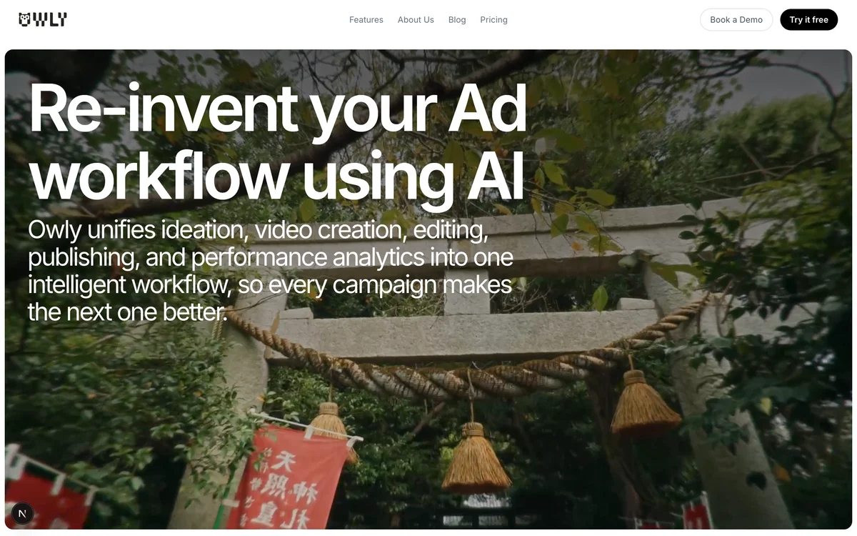
Owly
An AI video tool for marketing teams, built around brand context and editable drafts. I'm one of three co-founders, leading product and design.
AI / EnterpriseCopilotResponse experiences
AI / Enterprise·2024 to present
Microsoft Copilot
Citations, response structure, and UX evaluation for Microsoft 365 Copilot. I work with product and engineering teams to make answers easier to read and inspect.
Fintech / Product·Jan to Jun 2024
Angel One
Six months of UX work in retail finance, alongside my final semester at IIT Guwahati and research into financial advice.
Fintech / AI concept·2024
Finsage
An AI-assisted financial adviser concept for people in India who want advice that fits their own situation. Aarya Kabara and I researched how people plan money and designed the path from a question to a plan.
AI / Product·2023
Reachify
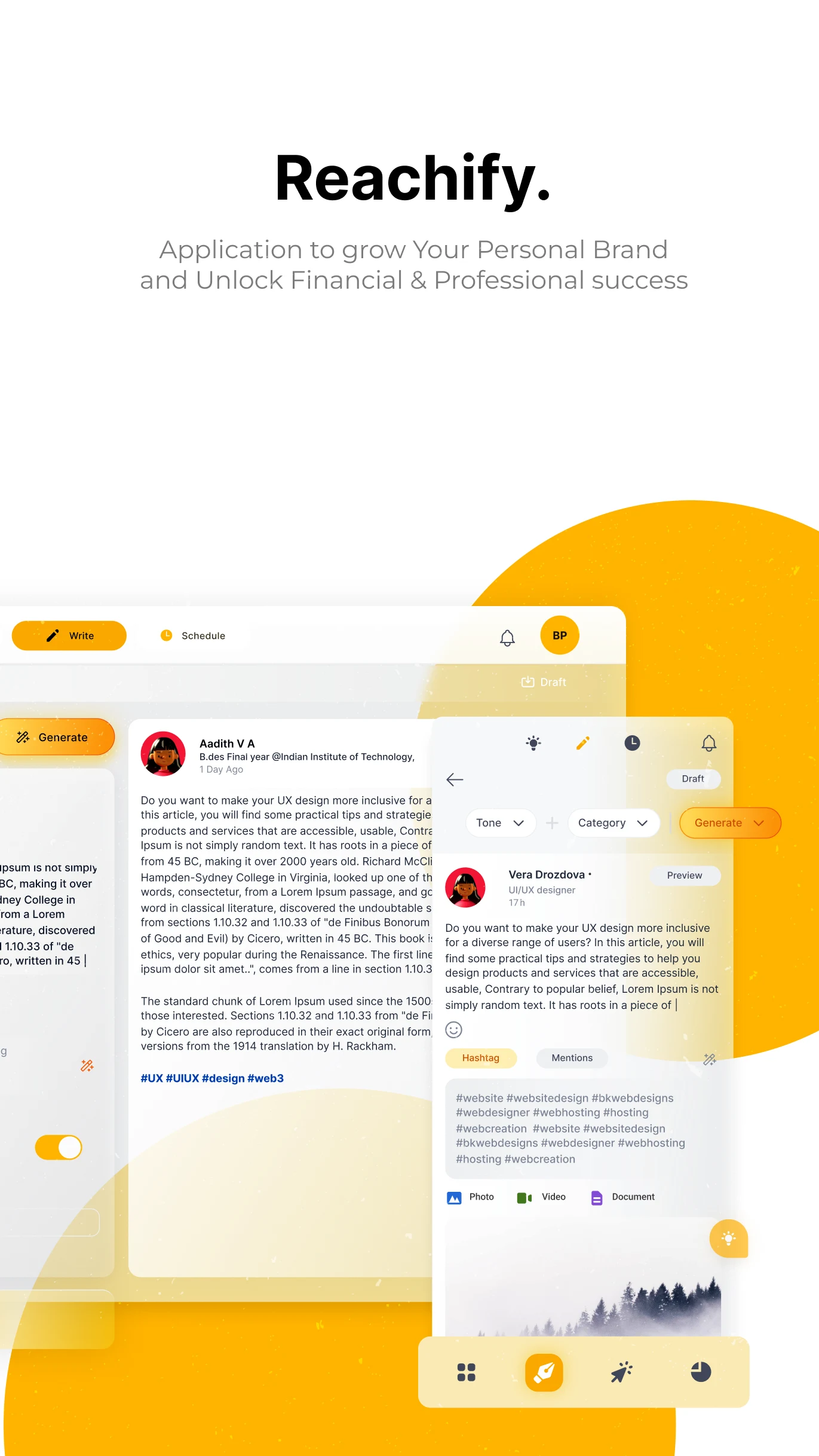
An AI-assisted LinkedIn writing and scheduling product. I researched posting habits and designed the path from an idea to a scheduled post.
Web3 / Startup·2022 to 2023
DaoLens
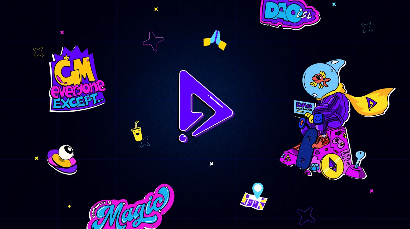
Product flows, brand, and marketing for a Web3 startup, including a shared two-week sprint to prepare its DAO Denver event identity.
Data / Product·2022 to 2023
Crunch
Dashboard and information design for an analytics product, with attention to comparisons, status, and how the interface presents uncertainty.
Pinned to the board
Hello, I'm Aadith.
I'm based in Hyderabad. Here's a little about how I work and what keeps me curious.
- Responses, sources, and evaluation
- Copilot UX
- Early paid Owly customers
- 8+
- How I prototype
- Figma ↔ code
- Cross-country bicycle rides
- 2× India
I grew up in Kerala, drawing long before I knew design could be a job. At IIT Guwahati, I got to work across different media. Alongside my degree, I joined early-stage teams where the work could move from a product flow to a brand or a demo in the same project. I liked being close enough to the work to try an idea myself.
At Microsoft, that means paying attention to how a Copilot answer reads, how someone checks a source, and what happens when the content changes. I also work on ways to evaluate those experiences. A lot of my contribution is making a design concern specific enough for the team to discuss, test, and fix together.
I co-founded Owly with two friends from school in 2025. Working directly with customers has made me more willing to reconsider the product. We changed who we were building for as we learned what people would pay for, and hands-on video work exposed decisions our software didn't yet support. I move between product design, customer conversations, and building demos to work through those gaps.
Outside work, I cycle long distances. I've crossed India twice: first north from Kerala toward Kashmir, then south with the 2025 Ride for Unity. On the second ride, I represented Kerala in a group of about 150 riders with a large support team. The food and the people I met are as much a part of those memories as the riding.
How I work
I often use a prototype to think through a question with other people. Trying the interaction gives us something specific to discuss, including the parts I haven't worked out yet.
Find out who can do what
I map the people involved, what they can see or change, and where a flow might fail. That helps me work out what a screen needs to explain before I start refining it.
Explain what makes a version better
I use research, examples, and evaluation criteria to explain a design choice. If two people disagree, a concrete example often helps us find out whether we're judging the same thing.
Put the idea in someone's hands
When a discussion gets stuck, I build a few variants or a working interaction. I bring a recommendation too, so the team has something specific to test and respond to.
Stay involved while it's built
Real content, loading states, and keyboard navigation can expose gaps in a mockup. I work with engineers to resolve them, sometimes making a small presentation or accessibility fix in code for engineering review.
Along the way
2020
Started design school at IIT Guwahati
Started my Bachelor of Design. I worked across different media and learned to choose a method based on the question I was trying to answer.
2022
Joined the early design team at DaoLens
While still studying, I worked on product flows, the brand, fundraising material, and events for a Web3 startup. I saw how quickly a small team's priorities could change with the market.
2023
From creator interviews to a Reachify prototype
Cold outreach led to interviews with 15 to 20 active LinkedIn creators. I used those conversations to design and prototype a workflow for finding an idea, writing a post, and scheduling it. A short MVP deadline kept the scope focused.
2024
Personal finance thesis and Angel One
My final-year thesis explored personal financial guidance in India through interviews with advisers and potential users. I also spent six months in a product role at Angel One.
2024
Microsoft - Product Designer
Joined the M365 Copilot team, working on how people read an AI-generated answer, inspect its sources, and judge whether they can use it.
2025
Owly - Co-founded
Started Owly with two friends from school. As we moved into video for brands, early paid work helped us understand which parts of production customers needed more control over.
2025
Ride for Unity
Represented Kerala in a government-supported ride from Kashmir to Kanyakumari, covering roughly 4,000 km in 16 days with about 150 riders.
2026
Sharing AI methods and building the Lab
Helped make AI-assisted design methods easier for other designers to find and use. In the Lab, I continued building small tools for evaluating AI output, mapping agent behaviour, and connecting Figma with code.
Read the cycling storiesFrom the notebook
Notes from trying things.
What I've learned using AI in design, and why the messages around an answer deserve attention too.
Note 01 / AI in product design
What I check after AI builds the first version
AI saves me the most time when I need to put an idea in front of someone. I can move from a rough flow to a working code prototype before polishing a static specification. Once someone can try it, the gaps become easier to see: a missing state, unclear feedback, or an interaction that only made sense in my head.
I still need to understand the problem before I build. I sometimes use synthetic personas to find questions worth asking, but I don't treat their answers as research. A conversation with a real person brings details I wouldn't know to prompt for. AI can also help group research notes, provided I check the groups against the evidence and the product context.
After the first version runs, I work through the interface more carefully. What happens while it loads? Can someone use it with a keyboard? Does the layout survive real content? AI makes it easier to generate another version, so I need to be clear about which problem that version is meant to address.
A prototype also needs a separate decision about whether it belongs in production. Security, data handling, and edge cases need review, even when the demo looks convincing. I can sometimes contribute a small interface fix and have an engineer review it. Other parts need more work than a prototype was built to answer.
I take the same approach to prompts and shared tools. Before recommending one, I want to see it used on a real task and hear what needed fixing. A small set of tested examples is easier to trust and maintain. If an example doesn't hold up, I remove it.
Before I generate another version, I want to know which problem it's meant to address.
Note 02 / Conversation systems
When a chat needs a system message
A chat contains more than the messages people send. It may need to record that an action finished, a session ended, or access to the conversation changed. Those small system messages affect how someone understands the timeline and what they do next.
I found it useful to classify these messages by their job before writing them. That gives a team a shared way to decide which events need the same wording, placement, and behaviour. Otherwise, each new message becomes another design decision made in isolation.
The classification needs boundaries. An assistant answering a request is ordinary chat output. A network outage needs an application error. A suggestion collapsing may need no message at all. My first check is whether the person has learned something new from the event. If they haven't, adding a sentence can make the conversation harder to follow.
For events that do need a message, I aim for one sentence that says what happened. An avatar or a conversational opening can make the system seem like another participant. I also distinguish records from reminders: an event belongs in the timeline, while a reminder can disappear if the information remains easy to find elsewhere.
I start by asking what the person needs to know about the event.
On the wall and shelf
A few milestones.
My design degree, a medal from Ride for Unity, and a few steps along the way.
2024
I completed my Bachelor of Design at IIT Guwahati in May 2024 and received the degree on 14 July. This is the certificate hanging in the room.
View certificate2025
I represented Kerala in the supported 2025 Ride for Unity from Kashmir to Kanyakumari. With about 150 riders, we covered roughly 4,000 km in 16 days. I kept the medal.
View medalFrom work
2024
Microsoft - Product Designer
Joined the M365 Copilot team, working on how people read an AI-generated answer, inspect its sources, and judge whether they can use it.
2025
Owly - Co-founded
Started Owly with two friends from school. As we moved into video for brands, early paid work helped us understand which parts of production customers needed more control over.
Away from the desk
Across India, twice.
I've cycled across India twice. At twenty, I set off north from Kerala toward Kashmir on a mostly independent ride. In 2025, I rode south with the government-supported Ride for Unity expedition.
2025
Ride for Unity
Kashmir to Kanyakumari
- Distance
- Roughly 4,000 km
- Duration
- 16 days
- Group
- About 150 riders
- I represented
- Kerala
In 2025, I represented Kerala in Ride for Unity. About 150 of us covered roughly 4,000 km from Kashmir to Kanyakumari in 16 days, with several stages longer than 200 km. A large support team helped us through a much faster and more structured journey than my first ride.
At twenty
The first ride north
Kerala toward Kashmir
The first ride took me past beaches, through cities, and across dry plains and hills. I remember the local food and the strangers who made me feel at home. Thinking about the whole route could be overwhelming, so I concentrated on getting to the next town.
Finishing those long days depended on food, sleep, and support as much as time on the bike. That's part of the story I want to remember alongside the distance.
Open on the laptop
Ideas I had to try in code.
Tools for reviewing AI output, testing agent behaviour, and connecting Figma with code. Some run end to end; others test one part of an idea.
I build these to work through questions I run into as a designer: how to check an AI response, make an agent's behaviour easier to discuss, or draw Figma annotations from a script.
I pair-programmed most of the selected projects with Claude Code, setting the problem, shaping the interaction, and checking the result. Each write-up explains what works and what still needs attention.
More from the Lab
Smaller utilities, marketing pages, and experiments in progress.
Tools & CLIs·2026
Keyboard-first calculator
A calculator with reusable history, memory controls, and careful handling of percentages and decimal arithmetic.
Tools & CLIs·Jan 2026
Screenshot accessibility triage
Flags possible accessibility issues in a screenshot, then suggests how to check them manually.
Tools & CLIs·2026
Design Relay
A tool in progress for comparing Figma designs with Azure DevOps changes and drafting a review people can check.
Tools & CLIs·2026
GifGen
Converts product recordings to GIF or WebP with saved presets, batch jobs, and fewer FFmpeg flags to remember.
Prototypes·Feb 2026
FHL Agent Design
A scrollable visual essay that puts an agent UX concept on screen for discussion.
Owly·2026
Early Owly marketing page
An early direction for the Owly homepage, with a video carousel, motion, and a before-and-after comparison.
Owly·Nov 2025 - Mar 2026
Owly Studio
The Owly product workspace, from onboarding and brand inputs to media libraries and timeline editing.
Owly·Feb 2026 - Mar 2026
Owly marketing site
A video-led introduction to Owly, with product features, pricing, tools, and articles to explore.
Inside the yellow box
Trying out design tools.
Experiments in editing Figma from code, mapping an agent's behaviour, and comparing conversation patterns.
Explore the rest of the LabOn the laptop
Find the hidden stickers.
There are two stickers to find on the laptop. Take a closer look and select each one.
The counter below keeps track as you find them. There's no timer.
You can also use the keyboard. Tab through the desk objects and press Enter to select a sticker.
0 of 2 discovered
2024
Bachelor of Design · IIT Guwahati
I completed my Bachelor of Design at IIT Guwahati in May 2024 and received the degree on 14 July. This is the certificate hanging in the room.

2025
Ride for Unity medal
I represented Kerala in the supported 2025 Ride for Unity from Kashmir to Kanyakumari. With about 150 riders, we covered roughly 4,000 km in 16 days. I kept the medal.
 Read about the ride
2025 to present
Owly
Video drafts that remember the brand
A marketing team needs more than a video that looks good on the first try. It needs the product, tone, and edits to hold together across versions. I started Owly with Adi and Hari, two friends I've known since school, to work on that process. I lead product, design, and customer storytelling; Adi works on AI systems, and Hari handles the backend and operations.
Interactive recreation · local edits and simulated render
Clip - 2
 Visual Settings
Product Image
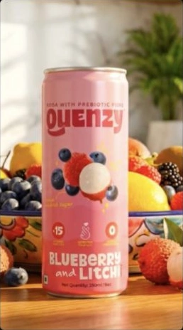
Meet Thequenzy—a refreshing and healthy prebiotic soda crafted for your gut's
0s10s20s30s40s50s60s70s


Video Library
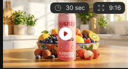
65%
Video Library
Close-up of a hand pulling a Thequenzy prebiotic soda can from a modern, minimalist refrigerator in a bright, sunlit k...
Video Library
Close-up of a hand pulling a Thequenzy prebiotic soda can from a modern, minimalist refrigerator in a bright, sunlit k...
✓Video Generation startedSimulation only. No video is generated or email sent.
Select a purple clip and edit its voiceover. All sample clips reuse the supplied still; no live generation or credit transaction occurs.
We changed who we were building for
We began by exploring safer, more personal AI video for children. Finding buyers and getting frequent feedback proved difficult. In 2025, we shifted to brands and growth teams with recurring video needs and budgets. The audience changed, but the questions about identity and control stayed useful: what context should the system remember, and what should the person be able to change?
One brief becomes many versions
A video brief passes through scripts, production, edits, and approvals, then often needs several versions for different formats. In customer work, we kept seeing how much effort went into making those versions usable. A promising generated clip still needed someone to check the product, resolve conflicting brand rules, and fix individual scenes.
Keep editing connected to the draft
Owly uses a brand's website and past creative as context for a video draft. The marketer can ask for changes in plain language and see them applied in the editor. My design work follows that loop from the initial brief through review and revision. We're still improving it, especially the control a person has when only part of a draft needs to change.
The V2 library design keeps generation progress visible while another video is ready to preview. Captured design state, not a live render.Product principles
The decisions guiding the editor
These principles guide the product as we move more of the production work into software.
- 01
Learn the brand once
Keep the website, catalog, tone, and past creative available across briefs, so the team can build on what it has already supplied.
- 02
Show the plan before the render
Give people a script, storyboard, and points to review before committing to a long generation step.
- 03
Revise one scene
Let a person fix the part that needs work. Rerendering an entire video costs time and can disturb scenes that were already right.
- 04
Carry learning forward
Use feedback and, where available, performance history to inform the next brief. This is part of the product we're working toward.
What still needs to become software
The longer-term aim is to reuse brand context, product catalogs, past creative, and performance history across projects. We haven't built that whole system. For now, we work closely with customers and do some production work by hand, paying attention to decisions that come up often enough to deserve a place in the product.
Completed-video library design with preview and download affordances. Original V2 viewport capture.My work moves between the editor and the customer
I design the interaction flows and prototypes, build the brand and website, and prepare customer demos. I also write the editor's prompts for clarification. Moving between those tasks helps me see where the product asks too much of a customer, or where a demo makes something look easier than it is in daily use.
- Co-founders
- 3
- Early paid customers
- 8+
- Company
- Self-funded
- Current model
- Service + software
Learning from paid video work
We've worked with at least eight early paid customers while funding the company ourselves. That gives us real briefs, revisions, and approval cycles to learn from. It also keeps the question practical: which parts can customers repeat with the product, and which still depend on us? The current mix of service and software gives us a way to find out.
How the product fits together
The frontend uses Next.js, React, and Tailwind, with FastAPI and Supabase behind it. A Python pipeline coordinates video, voice, and language models, Pinecone stores brand context, and the editor builds on the open-source Friction project. Keeping context, generation, and editing connected is central to the workflow we're building.
What would make Owly worth returning to?
I want a creative team to come back because the next video is easier to make. That means carrying useful context forward and giving people enough control to finish the work.
2024 to present
Microsoft Copilot
Helping people read and check an AI answer
At Microsoft, I design and evaluate Copilot response experiences across Microsoft 365. My work includes how an answer is structured, how its sources appear, and how we review its quality. I work with product, engineering, research, evaluation, and accessibility partners, with particular attention to the details that help someone understand and check a response.
What I work on
Four connected parts of my role
The same response needs clear hierarchy, useful source context, repeatable quality checks, and careful implementation.
- 01
Clarify the response
Give the answer, source information, and actions a clear order so a reader can find what matters next.
- 02
Keep sources close
Connect claims to source material, with more context available when a reader wants to check the answer.
- 03
Define what quality means
Turn design concerns into criteria and labeled examples that the team can use across responses.
- 04
Stay close to implementation
Use running prototypes and small presentation-layer fixes to check interaction, accessibility, and visual fidelity.
Sources need to be part of the reading flow
I designed citation and reference patterns with the wider team to help people trace responses back to source material. Showing more source information can help someone check an answer, but it can also crowd the reading experience. We worked through what belongs beside a claim and what should appear when the reader asks for more context.
Citation flow
From a claim to its source
The flow gives readers increasing levels of detail, from a compact reference to the source itself.
- 01
Show the source
Keep source identity close enough to the claim that the relationship is clear.
- 02
Preview the context
Offer a short preview so the reader can judge relevance before leaving the response.
- 03
Open the source
Provide a route into the source when someone needs to read beyond the preview.
Giving the response a clearer hierarchy
I helped modernize Copilot responses across layout, source hierarchy, actions, and visual clarity. My contribution included critique and edge-case review, looking at how those elements worked together. The wider program shipped through cross-functional product work; it was a shared effort across many parts of the response experience.
Making design judgment repeatable
A design concern is easier to act on when the team can describe it consistently. I co-created a UX quality-evaluation framework, translating design judgment into reusable criteria, labeled examples, and regression checks. The framework became operational and surfaced quality issues across multiple response experiences. It gave us a more concrete basis for reviewing where an answer needed work.
Checking the details in code
A running interaction reveals details that are hard to judge in a static specification. I use code and near-production prototypes to validate those details, and work with engineering on low-risk presentation-layer improvements. Contributions have included accessibility, spacing, typography, corner radii, and design-system fidelity.
Working through accessibility and specification reviews
I contribute to formal accessibility and design-spec reviews alongside recurring critiques and cross-functional checks. These reviews bring constraints into view that I might miss working on the interface alone. They also make implementation details part of the design discussion before launch.
Sharing AI methods with other designers
I helped lead an internal initiative documenting AI-assisted methods for research, synthesis, prototyping, evaluation, and implementation. I organized recurring sessions and demos and contributed to the website and rollout planning. We shared methods we had tried, including the parts that still needed judgment or manual work.
The questions I keep bringing to reviews
I'm still working through how much source context helps before it becomes clutter, and which quality checks should remain a human judgment. Concrete examples make those questions easier to discuss. I bring unusual sources and accessibility cases into review, then work through them with teammates who understand other parts of the system.
Jan to Jun 2024
Angel One
Learning inside a financial product
I worked in UX at Angel One from January to June 2024, during my final year at IIT Guwahati. It was my first experience inside a large financial-services product. I paid closer attention to how an interface explains a decision before asking someone to act, particularly when money, risk, and uncertainty are involved.
The overlap with my final-semester research
Alongside the role, I was researching financial advice as part of my academic work. The two brought me back to the same questions: what does someone need to understand before acting, and how should the interface explain costs or uncertainty? Those questions shaped what I looked for in flows and design reviews.
Market Snapshot — two layout studies
Two preserved email-layout variants dated 15 May 2024. Draft copy and inconsistent dates remain visible; these are historical design studies, not current market reporting. Both complete disclaimers are retained.Scroll inside the image to see the complete design. Reading size enlarges small text. What I learned
What I learned to look for
The role sharpened my attention to a few details that affect how confidently someone can make a decision.
- 01
Explain the decision
Make clear what the person is choosing, what happens next, and where they can read the detail before committing.
- 02
Leave room to reconsider
Give people room to compare and pause. Hesitation can point to missing information that the interface needs to explain.
- 03
Keep costs in view
Make the primary action easy to find while keeping relevant costs, risks, and constraints readable.
- 04
Describe the other states
Include validation, errors, and exceptions in the design so implementation has more to work from than the successful path.
- Timeline
- 6 months
- Domain
- Retail finance
- Context
- Final semester
Keeping pricing and its qualifications together
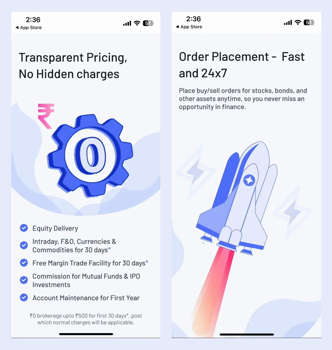
Dated design work from a July 2024 recording. The pricing message, offer details and qualifying footnote remain together while the illustration moves. Shown as historical design material; the terms do not describe a current offer. Silent excerpt.View still image, opens in a new tab The complete promotional screens
Promotional design specimens from the local source recordings. The rocket illustrates the source headline; it does not demonstrate a transaction flow or verify a current product claim.Scroll inside the image to see the complete design. Reading size enlarges small text. The question I carried forward
Can someone tell what will happen before they tap? I kept returning to that question in financial-product work.
2024
Finsage
Advice that was easy to find but hard to use
In our interviews, people described following a friend's tip, staying with familiar insurance policies, or not knowing how much to save for what they wanted. General advice was easy to find online, but it rarely fit their income, family, or plans. Finsage was our design project at IIT Guwahati in 2024, supervised by Dr. Pratul Chandra Kalita: a concept for an AI-assisted adviser that starts from a person's own situation.
Learning how people actually plan money
We started with desk research on personal finance in India: government savings schemes, a SEBI investor survey, the apps people already use, and the ways advice is given today, from bank managers to robo-advisers. Then we interviewed eight people about their money habits and learned from financial advisers through interviews and workshops. Affinity mapping turned those notes into needs, pain points, and three personas.
Affinity mapping from the interviews, and the journey from noticing a need to managing advice over timeI'm not really sure how much I need to be saving now to meet my future goals.
Product direction
Advice first, money later
Our problem statement asked how we might give people tailored information that matches their circumstances, knowledge, and goals. We planned the product in three phases.
- 01
Advise
Answer questions and build plans from a person's profile, goals, and comfort with risk.
- 02
Track
Follow goals and life events, and adjust a plan when circumstances change.
- 03
Invest
Later, help people act on a plan, including managing funds through the product.
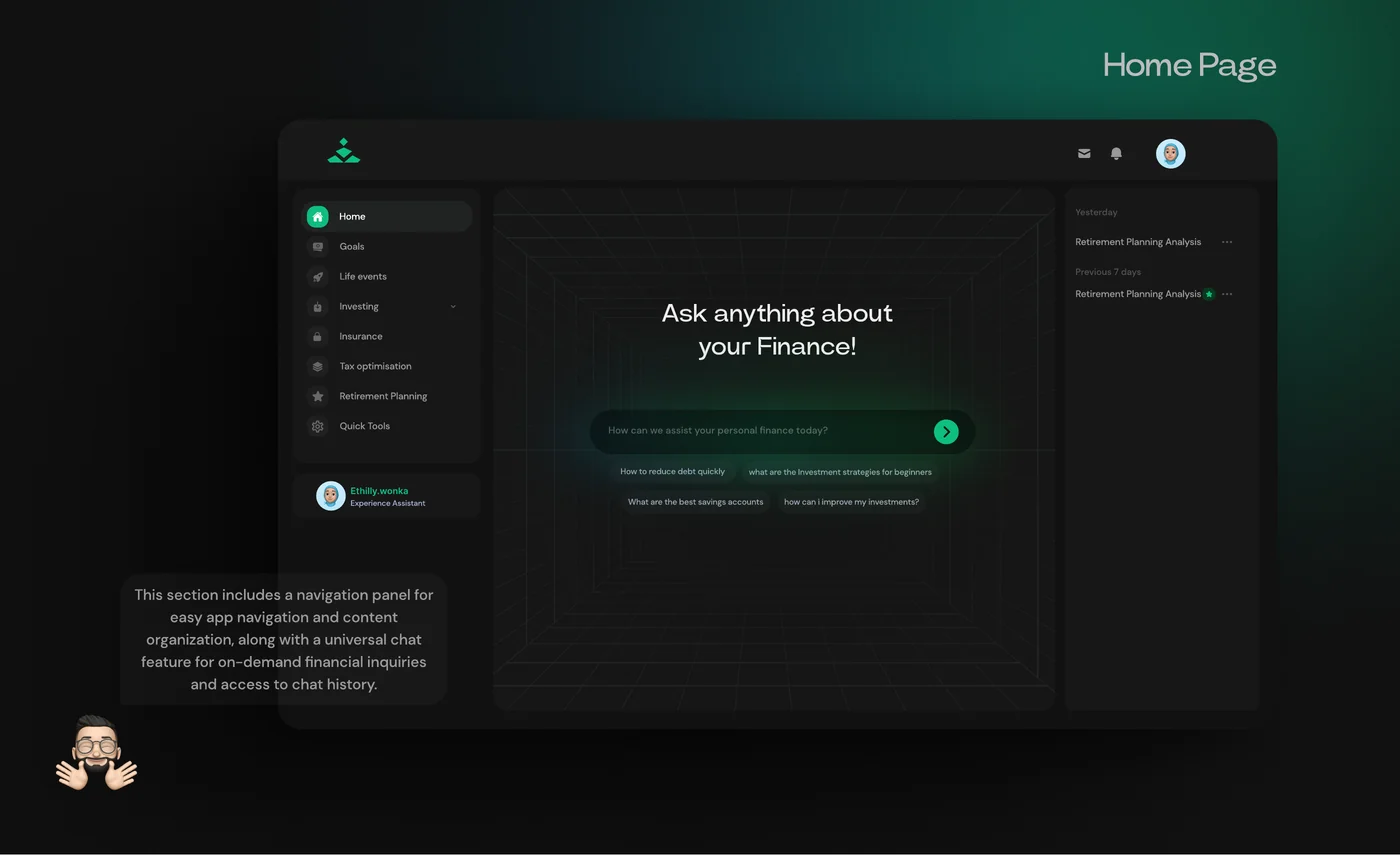
The concept, which combines a person's profile and goals with product data and an AI assistant, and the information architectureFrom a question to a plan
Onboarding is a conversation about a person's situation and comfort with risk. From there, someone can ask a question and follow the steps behind the answer. Goals and life events, such as changing jobs or saving for college, lead to a plan with a monthly amount, a timeline, and suggested options. A 'Talk to an advisor' button stays close at every step, because the concept kept human advisers in the loop.
Onboarding as a conversation, and an answer that shows the steps behind itSetting up a goal, the resulting investment plan, its projected value, and life events as starting pointsWhat stayed a concept
Finsage was a student project. The answers, recommendations, and projections in these screens are designed examples, not the output of a working model. The part I still think about is how an AI product shows where its advice comes from, and when it should hand the decision back to a person.
- Year
- 2024
- Team
- 2 designers
- Interviews
- 8
- Screens
- 20+
2023
Reachify
Making room for a regular writing habit
Reachify was built for professionals who wanted to post regularly on LinkedIn but struggled to find the time or decide what to write. Over four months, I worked as the sole product designer across research, information architecture, UI, and an AI-assisted prototype. I focused on the tasks people needed to repeat: finding an idea, writing, scheduling, and reviewing the response.
Final Create recreation · synthetic drafts · live preview is representative, nothing is published

Demo creatorProduct designer · synthetic portfolio sample1 Day Ago
PreviewDo you want to make your UX design more inclusive for a diverse range of users? In this article, you will find some practical tips and strategies to help you design products and services that are accessible, usable, and enjoyable. Start with clear language, readable typography, and controls that work with a keyboard. Test the small details with the people who will use them.
An inclusive design process makes room for different perspectives. Keep the context visible, question your assumptions, and improve the experience together. Consider the small choices people encounter every day: the label on a button, the order of a form, and the relationship between a claim and its source. Each decision can make a task easier to understand.
Start by listening to the people using the product. A clear hierarchy helps someone find the next step, while consistent language helps them understand what a control will do. Provide enough context to make a decision without filling the screen with everything at once. Give people room to explore at their own pace.
Try the interface with a keyboard as well as a pointer. Review text at different sizes and look at the same task on a smaller screen. A useful design review asks what happens when the content changes, a title gets longer, or someone approaches the task in a different way.
These are synthetic examples for this portfolio recreation. The draft is editable, so you can explore how writing preferences, suggested hashtags, and a preview fit into the original workspace.
#UX #UIUX #design #web3
Saved ideas · Viral Post
AI Generated PostArticleViral PostTrending Topics and News
Demo creatorSynthetic sample idea1 Day Ago
Do you want to make your UX design more inclusive for a diverse range of users? Start with the small details.
Demo creatorSynthetic sample idea1 Day Ago
A source beside a claim can make an answer easier to verify. Keep the context close to the conversation.
Last edited: sample metadata · synthetic draftDo you want to make your UX design more inclusive for a diverse range of users? In this article, you will find some practical tips and strategies to help you design products and services that are accessible, usable, and enjoyable. Start with clear language, readable typography, and controls that work with a keyboard. Test the small detail
Last edited: sample metadata · synthetic draftA sample design reflection for draft 2. Make the context easy to find. Use clear labels, readable text, and controls that work with a keyboard. Start with one detail, try it with people, and build on what you learn.
Last edited: sample metadata · synthetic draftA sample design reflection for draft 3. Make the context easy to find. Use clear labels, readable text, and controls that work with a keyboard. Start with one detail, try it with people, and build on what you learn.
Last edited: sample metadata · synthetic draftA sample design reflection for draft 4. Make the context easy to find. Use clear labels, readable text, and controls that work with a keyboard. Start with one detail, try it with people, and build on what you learn.
Last edited: sample metadata · synthetic draftA sample design reflection for draft 5. Make the context easy to find. Use clear labels, readable text, and controls that work with a keyboard. Start with one detail, try it with people, and build on what you learn.
Last edited: sample metadata · synthetic draftA sample design reflection for draft 6. Make the context easy to find. Use clear labels, readable text, and controls that work with a keyboard. Start with one detail, try it with people, and build on what you learn.
Demo creatorOriginal synthetic idea1 Day Ago
Do you want to make your UX design more inclusive for a diverse range of users? In this article, you will find some practical tips and strategies to help you design products and services that are accessible, usable, and enjoyable. Start with clear language, readable typography, and controls that work with a keyboard. Test the small details with the people who will use them.
An inclusive design process makes room for different perspectives. Keep the context visible, question your assumptions, and improve the experience together. Consider the small choices people encounter every day: the label on a button, the order of a form, and the relationship between a claim and its source. Each decision can make a task easier to understand.
Start by listening to the people using the product. A clear hierarchy helps someone find the next step, while consistent language helps them understand what a control will do. Provide enough context to make a decision without filling the screen with everything at once. Give people room to explore at their own pace.
Try the interface with a keyboard as well as a pointer. Review text at different sizes and look at the same task on a smaller screen. A useful design review asks what happens when the content changes, a title gets longer, or someone approaches the task in a different way.
These are synthetic examples for this portfolio recreation. The draft is editable, so you can explore how writing preferences, suggested hashtags, and a preview fit into the original workspace.
#UX #UIUX #design #web3 ‹ July 27 – July 30, 2023 ›Wednesday
Choose a sample time slot. Local demonstration only.
Talking to people with an existing posting habit
I sent more than 100 outreach messages and interviewed 15 to 20 active LinkedIn creators, generally with 2,000 to 10,000 followers. They had experience posting but usually managed the work themselves. Finding ideas, making time, and moving between disconnected tools came up repeatedly. Some also hoped to earn money from their expertise, but were unsure how to build a consistent presence.
Product structure
Organizing the work around four recurring tasks
I used those recurring tasks to organize the product into Create, Engagement, Analytics, and Dashboard.
- 01
Create
Find an idea, adjust its tone and category, add hashtags, and schedule the post.
- 02
Engagement
See who is responding and find conversations worth following up on.
- 03
Analytics
Review follower, impression, and post trends to understand how earlier work performed.
- 04
Dashboard
Bring the next writing, scheduling, or review task into one place.
Source process board: proposed responses to recurring content-creation problemsA two-day MVP narrowed the scope
An investor deadline left two days to prepare the MVP. I focused on onboarding and Create, the shortest complete path from joining the product to scheduling a post. Analytics and Engagement stayed marked 'coming soon'. That choice let me concentrate the sprint on a flow someone could work through from beginning to end.
Create screens for drafting and scheduling across web and mobileWriting for Reachify while designing it
I also wrote and designed content for Reachify's LinkedIn page, including carousel posts, hooks, storytelling formats, and templates. That work contributed to the page reaching 2,000 followers. Maintaining a posting routine gave me a more direct understanding of the task I was designing for, particularly the effort needed before a draft was ready to publish.
- Timeline
- 4 months
- Screens
- 30+
- Interviews
- 15 to 20
- Page followers
- 2,000
I too face this problem of not knowing what to post and how. Have been trying to build a profile that catches eyeballs and ReachifyMe has been a very helpful tool.
2022 to 2023
DaoLens
Moving between product and brand
At DaoLens, I worked across onboarding, contributor dashboards, governance-related product work, campaigns, and visual systems. As an early designer, I moved between the product and the material used to explain it. An interface might need to clarify an unfamiliar Web3 concept; an event banner had to make the product worth a closer look.
A visual language for contribution
The concept connects community contributions with four reward families and five visual levels. These are preserved design states; the source does not establish shipped reward rules or a complete onboarding flow.Scroll inside the image to see the complete design. Reading size enlarges small text. Introducing Robin
Robin's character and extension introduction from the DaoLens presentation. Stills from the introduction video further down show Robin at work.Scroll inside the image to see the complete design. Reading size enlarges small text. Robin, DaoLens's AI assistant for community discussions, proposals, and projects, in a still from its introduction video (2023)Scope of the role
Different formats, the same product to explain
Moving between these areas made it easier to notice when the product and its explanation no longer matched.
- 01
Product
I worked on onboarding and contributor experiences, where unfamiliar Web3 terms needed enough context to be useful.
- 02
Brand
The visual system had to extend from a B2B product into community events and marketing material.
- 03
Marketing
I made event material, social posts, product explainers, and campaigns alongside the product work.
- 04
Changing briefs
Priorities shifted quickly, so the role involved picking up work across these areas as the company needed it.
Three jobs from the same video: summarising discussions, reading proposals, and planning projectsA Robin answer with its reminder that AI responses can be inaccurate, and a social post for a DaoLens round table in January 2023A closer look at DAO Denver
The DAO Denver case study shows that range in a concrete project: adapting the brand for a booth, merchandise, social posts, and a paper game in two weeks. Ans K James and I share credit for the work. The DaoManager and Robin material above belongs to separate product concepts.
- Period
- 2022 to 2023
- Environment
- Early startup
- Scope
- Product, brand, marketing
- Detailed case study
- DAO Denver
What connected the different briefs
Some weeks I moved from an onboarding flow to event banners. Both needed to explain the same product, at different levels of detail.
2022 to 2023
Crunch
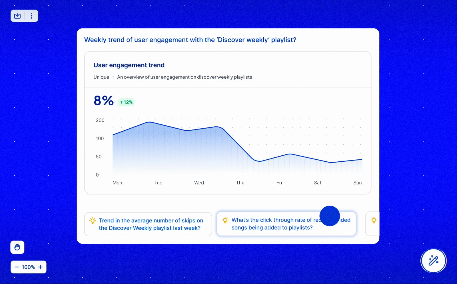
Weekly trend of user engagement with the ‘Discover weekly’ playlist?
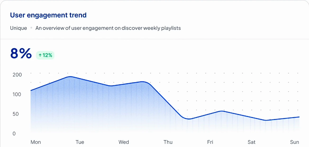
💡 Trend in the average number of skips on the Discover Weekly playlist last week?
Interactive recreation from the recorded product presentation. Choose the suggested follow-up, focus its chart, then zoom out. Source mockup figures; no live analytics. Question result Giving a dense dashboard a starting point
I worked on dashboards and data visualisation for Crunch while studying and taking on startup and freelance projects. My responsibility was the presentation of the information: where someone starts reading, how they compare values, and what context they need to make sense of a chart.
Learning the domain through the interface
I brought dashboard experience and learned the analytics domain as I worked. My contribution was to the interface; I didn't build the underlying models. That distinction mattered when deciding how to present status and uncertainty, because visual clarity should reflect what the data can actually support.
Information design
What each view needed to explain
I kept returning to four questions when organizing a view.
- 01
Where do I start?
Establish the first thing to read before introducing charts, filters, and secondary metrics.
- 02
What am I comparing?
Make labels, scales, time ranges, and baselines clear enough for someone to judge the comparison.
- 03
What is still uncertain?
Make incomplete or ambiguous data visible, so the presentation doesn't imply more certainty than the evidence supports.
- 04
Where can I look next?
Provide enough context for the reader to choose the next detail to inspect.
A follow-up connects the engagement question to recommended songs versus playlist additions. Still from the original product presentation, not a live analytics session.The wider canvas connects related metric cards. Sample figures belong to the recorded mockup.Questions I still use
This work gave me a practical way to think about hierarchy, comparison, and uncertainty. I still return to those questions in citations, source panels, and evaluation reports: what is the reader seeing, and what can they reasonably conclude from it?
- Focus
- Dashboards
- Contribution
- Visualisation
- Domain
- Analytics
2025
Inline citations
Interactive recreation · synthetic review notes


Q2 Design Review – Project notes
Select a named source to inspect it. Use the arrows to browse its references; Escape closes the preview and returns to the citation.
Source design: named references, paragraph grouping, and passage highlighting. View full-resolution source, opens in a new tab Exploring source diversity alongside readability and verifiability. View full-resolution source, opens in a new tab Work and Web citation anatomy: source icon, title, and additional references. 1 · Source icon 2 · Source title 3 · Additional references View full-resolution source, opens in a new tab Rest, hover, and pressed states; title truncation; and Work file icons. Detail from the original specification. View full-resolution source, opens in a new tab Making an AI response easier to verify
I designed inline citation patterns for Microsoft 365 Copilot. The goal was to make a response easier to verify while keeping the answer readable. The existing experience made citations easy to miss: source names were not upfront, and it was hard to tell which text a reference supported. I worked on compact references that made the source recognizable and connected it more clearly to the answer.
Make the source recognizable before opening it
The design uses named sources for web references and a title with an icon for work files. Rather than making a reader open every reference to identify it, the compact pill gives them a starting point. A preview and deep link provide more context when they need it.
Balance reading flow with a precise connection
I explored the trade-off between grouping citations by sentence and placing groups at the end of a paragraph. The proposed pattern groups a source with its additional references, keeping the response easier to scan. Highlighting the referenced text on hover helps the reader see what the group supports. The comparisons also considered readability, verifiability, and diversity among primary sources.
Design decisions
Keep the first reference compact and useful
The reference is the first step in checking an answer. It needs to make the relationship to the source clear before asking the reader to open anything.
- 01
Identify the source
Keep the title and source metadata compact but recognizable, so the citation provides context beyond a reference number.
- 02
Keep it beside the claim
Place the reference close to the text it supports, so the reader can follow the connection.
- 03
Reveal more on demand
Use a hover preview to reveal more source context, with a deep link for someone who wants to continue into the original material.
- 04
Review the crowded cases
Define truncation and multiple-citation behavior, and reduce the visible actions at narrower widths so references do not overwhelm the response.
A compact reference needs more than a default state
I worked through the pill anatomy and its hover, selected, and highlighted states. The specification also connects inline references with a reference widget and deeper source context. These pieces need to feel like steps in the same reading flow, rather than separate interruptions to the answer.
From a compact pill to source context
The pill opens a source preview with metadata and navigation between sources. Contextual prompts and more actions sit alongside a transition into the reference widget. I documented Work and Web variants, single and multiple sources, rest, hover and pressed states, and how titles and icons behave when space is limited.
Interaction and accessibility
Keep the source available across ways of reading
- 01
Keyboard navigation
The specification uses Tab to enter the control, arrow keys to navigate, and Escape to close the popover, with Home and End recommended for navigation.
- 02
Screen-reader navigation
Include the citation and source relationship in the reading experience for people using a screen reader.
- 03
Responsive behavior
Progressively reduce actions as space tightens: Ask becomes icon-only, Preview moves into more actions, and the most constrained layout keeps the more-sources chevron.
A documented interaction pattern
The result of this work was an interaction pattern and detailed implementation specifications. The design connects a compact reference, a preview, and the original source, with explicit behavior for visual states, constrained layouts, and keyboard navigation.
Making UX quality evaluable
Representative dataset walkthrough · stored example annotations
Today
how are you?
 Copiloti
 I’m doing great, thanks for asking! How about you? 
Is there anything specific you’d like to work on today—maybe something design-related, or do you just want to chat for a bit?

Excessive whitespace
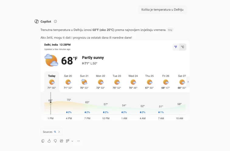
The weather card remains in English
Recreated baseline text specimen. Select the spacing variation to inspect its recorded rubric.
Scroll across the text specimen to inspect the full response.
Layout & visual consistency · 0.5
There is excessive whitespace between the text blocks in the response, making the spatial continuity weak.
These labels come from captured examples used to develop the evaluation specification. This walkthrough does not run an AI evaluator.
Captured text specimens: baseline 15 and spacing variation 15.1. View source 1 at full resolution, opens in a new tabView source 2 at full resolution, opens in a new tab A Croatian query and response with a weather card that remains in English. View full-resolution source, opens in a new tab Recorded rubric annotations for the spacing and localization examples. These scores label dataset examples. View source 1 at full resolution, opens in a new tabView source 2 at full resolution, opens in a new tab Turn design expectations into shared examples
I worked with design, data science, and engineering partners to capture and organize response examples for a shared UX evaluation system. The dataset gave the team concrete material to develop the evaluation specification: what good looks like, where a response breaks down, and why it receives a particular score. My contribution centered on captured examples, their organization, visual criteria, and annotations.
Build coverage across response types
A short text answer, a weather card, a table, and a response with citations have different visual requirements. The collection covered these formats alongside finance, sports, charts, code, and other response types. Baseline specimens and issue-specific variations made it possible to examine typography, spacing, alignment, component structure, and missing elements individually and in combination.
Evaluation rubric
Five recurring dimensions
- 01
Typography
Type scale, hierarchy, alignment, contrast, and spacing.
- 02
Layout and visual consistency
Grid, balance, density, and theme consistency.
- 03
Component craft
Rendering, clarity, metadata, and interaction affordances.
- 04
Structural completeness
Required elements, their placement, and citation–source relationships.
- 05
Localization
Language consistency, right-to-left layouts, text expansion, and truncation.
Pair a score with an explanation
The annotations pair a 1, 0.5, or 0 score with a written justification for each dimension. The explanation matters as much as the number: it makes the judgment inspectable and gives the team something specific to discuss while developing the specification. Versioned collections and scored batches support that review and refinement.
Compare variations in context
Related response specimens keep the context visible while isolating a difference. In one spacing example, the response remains readable but excessive whitespace weakens the connection between text blocks. Its annotation gives layout 0.5 while keeping the other dimensions at 1. Constructed variations like this help the team discuss why a difference matters.
Look beyond the main text
Localization includes the full response surface. One example pairs a Croatian query and response with a weather card that remains in English. The card renders clearly, but the language mismatch creates an inconsistent experience. Other examples examine right-to-left alignment, headers and actions that retain left-to-right ordering, and sources that do not match the response language.
Working across disciplines
The dataset was shared working material between design judgment and the technical evaluation specification. Comparative views and written explanations gave us concrete differences to review together. A separate typography study compared Copilot and ChatGPT response hierarchy, header width, body consistency, emoji use, and follow-up styling.
A shared reference for the evaluation system
My contribution was part of collaborative work on the captured dataset and specification. The purpose was to give data scientists and engineers concrete material for building the evaluation system, with design criteria, example annotations, and the reasoning that connects them.
A baseline, a meaningful variation, and a reason
A useful evaluation dataset needs more than examples of obvious failures. It needs a clear baseline, meaningful variations, and an explanation of why a difference matters. That structure helps design, data science, and engineering reason about quality together.
2025 to present
Following a citation
Help the reader find the relevant part
Opening a source can leave someone with another task: finding the passage that matters. Our citation work considered the steps between the generated claim and the original material. A short preview could help the reader judge relevance before opening a longer source, while keeping the response available.
Reading flow
Give each step a different job
The claim, preview, and source offer increasing detail. The reader should be able to stop when they have enough context or continue when they need more.
- 01
Connect the claim
Keep the source relationship visible beside the statement being checked.
- 02
Preview the context
Offer a short excerpt or preview that helps the reader decide whether to keep reading.
- 03
Continue into the source
Provide a clear next step into the original material while keeping the answer available.
A preview has to earn its space
The design trade-off is how much context to reveal at each step. A preview needs enough information to help someone judge relevance, but too much can interrupt the answer they were reading. Keeping a route into the original source lets the compact view stay focused without becoming the limit of what a reader can inspect.
2023
DAO Denver
A B2B brand with two weeks to get ready for an event
DaoLens was preparing a booth at DAO Denver during ETHDenver 2023. In two weeks, we needed to extend its identity across booth graphics, banners, social posts, merchandise, posters, pamphlets, website work, and a paper game. This was shared work with Ans K James, with both of us credited on the project.
Giving the existing brand a brighter event presence
DaoLens's B2B identity used futuristic forms and gradients. We kept parts of that language and added blocky illustrations, flat colour, and a sharp yellow accent, with Space Mono and Poppins for type. The result gave us a more playful set of elements to use across the event material.
Identity applications
From a sticker to the booth
The sprint covered eight deliverable formats alongside the booth. We reused the type, colour, and illustration language across these different sizes and purposes.
- 01
Booth and banners
Large graphics established the booth's identity, with a dartboard game as one of the merchandise activities.
- 02
Product material
Pamphlets and website mockups explained the DAO Manager product in more detail.
- 03
Merchandise
Stickers, shirts, mugs, notebooks, and tote bags carried the visual system onto objects people could take away.
- 04
Social posts
Posts applied the same identity to panel discussions and event activities.
Booth graphics, illustrations, and event applicationsA paper fortune-teller for the booth
We also made a folded paper fortune-teller with deliberately silly Web3 copy. It gave the event identity a small, tactile format alongside the banners and screens. Writing the fortunes was a chance to loosen up the language as well as the visuals.
Merchandise, social posts, paper game, and product material- Timeline
- 2 weeks
- Event
- ETHDenver 2023
- Formats
- 8
- Collaborator
- Ans K James
Tools & CLIs · Working
Keyboard-first calculator
A calculator with reusable history, memory controls, and careful handling of percentages and decimal arithmetic.
- When
- 2026
- AI tools
- Claude Code
- Status
- Working
- Type
- Web app
npm install && npm run dev
The decisions behind familiar buttons
I built this with Claude Code to use from the keyboard. As I added history, memory, and scientific operations, I kept finding decisions behind familiar buttons: how should a percentage behave, and what should happen when someone reuses an earlier result?
The interface stayed small while the checks grew. I worked through operator precedence, nested parentheses, keyboard controls, and decimal cases such as 0.1 + 0.2. The percent key took more thought than I expected.
What it does
- Basic arithmetic with operator precedence and nested parentheses
- Square, square root, reciprocal, sign toggle, and percentage operations
- A 50-item history with timestamps and reusable results
- Memory controls: MC, MR, M+, and M-
- Light and dark themes that follow the system preference
- Keyboard controls and ARIA labels
- Decimal handling for common floating-point cases such as 0.1 + 0.2
Screenshots
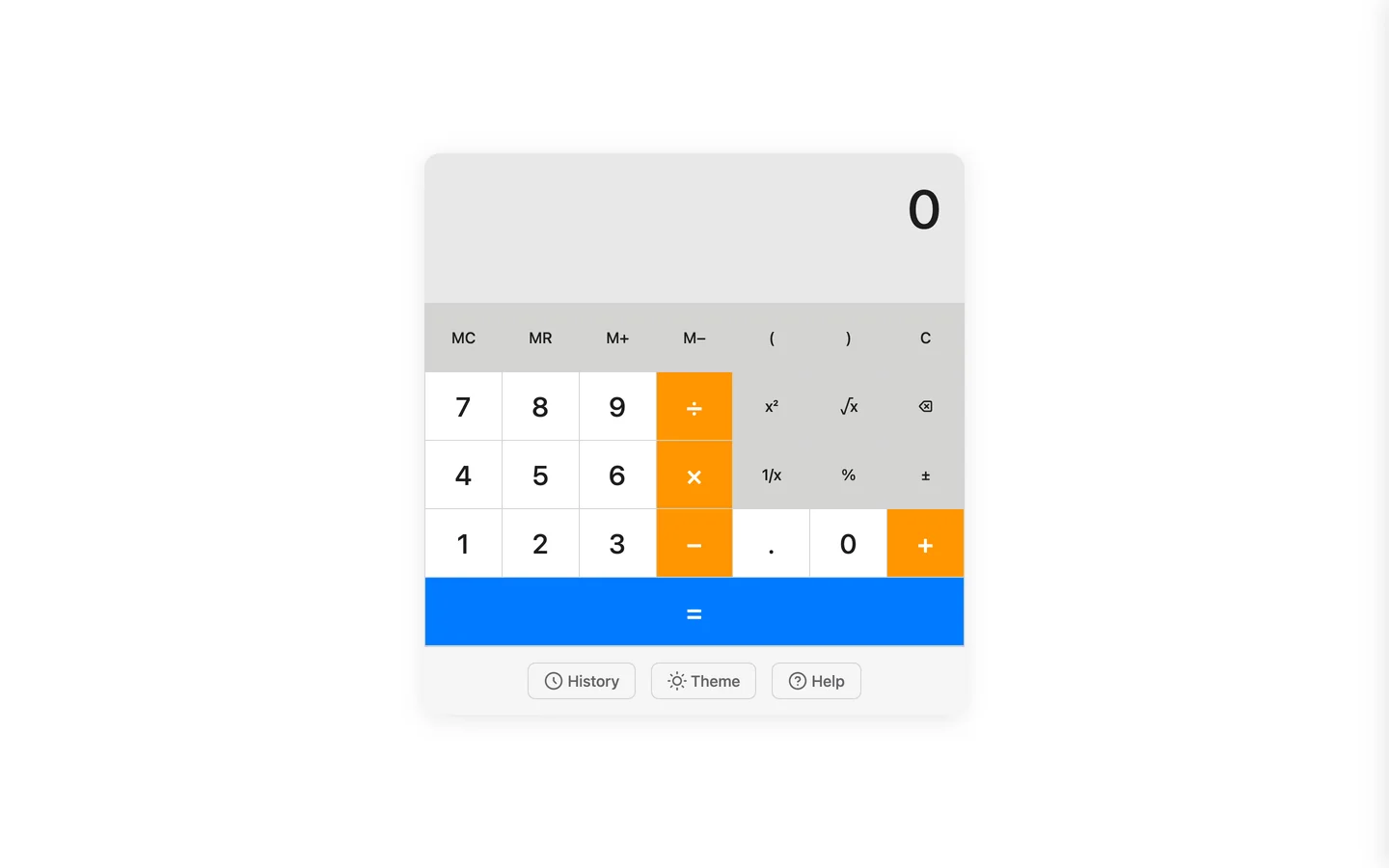 Home · Desktop
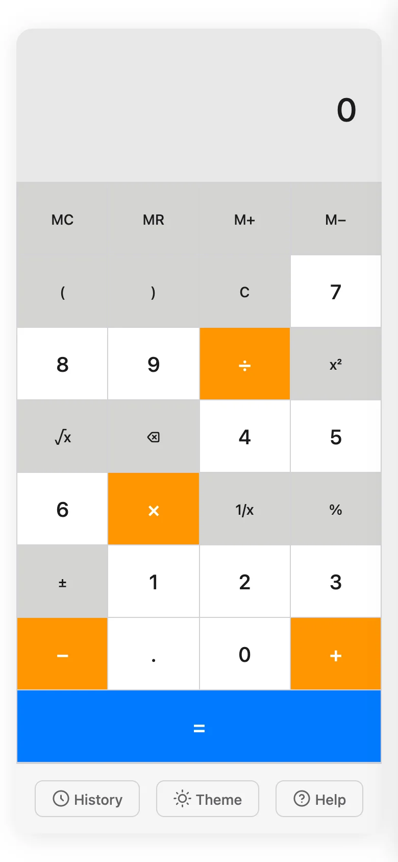 Home · Mobile
Tools & CLIs · Prototype
Screenshot accessibility triage
Flags possible accessibility issues in a screenshot, then suggests how to check them manually.
- When
- Jan 2026
- AI tools
- Claude Code
- Status
- Prototype
- Type
- Desktop app
Start with a screenshot, follow up by hand
Sometimes I only have a screenshot when I want to start an accessibility review. I built this prototype to make that first look more useful: flag possible issues, say how confident the check is, and suggest what to verify next.
It looks for visual cues around contrast, focus, and labelling. A screenshot can't reveal the underlying semantics or prove that keyboard navigation works, so those findings remain questions for a manual check. This is a triage aid, not an accessibility audit.
What it does
- Accept PNG and JPG screenshots by drag and drop, then run heuristic checks
- Choose web or Windows desktop UI as the review target
- Flag visual cues that may suggest contrast, focus, icon-only button, keyboard, or focus-order issues
- Show a confidence rating and manual verification step for each finding
- Export findings as JSON or bug-report text
- Run as an Electron desktop app with a Vite renderer
Screenshots
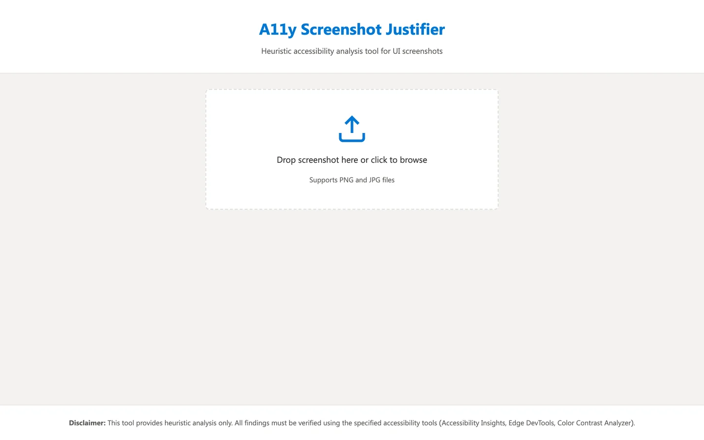 Home · Desktop
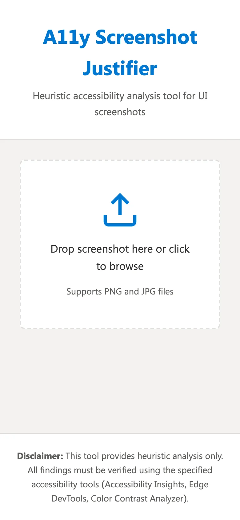 Home · Mobile
Figma and code review · Work in progress
Design Relay
A tool in progress for comparing Figma designs with Azure DevOps changes and drafting a review people can check.
- When
- 2026
- AI tools
- Claude Code
- Status
- Work in progress
- Type
- CLI / backend
Starting point
I kept adding ways to review, search Figma, generate scenarios, and discover files. The first version became harder to follow, even though the core task was straightforward: connect a design to a code change and show where they differ.
Bringing the review back to one comparison
I started with the setup work for an Azure DevOps design review. The first version gathered pull-request context, read Figma data, ran a vision pass, and drafted findings. As I added discovery, search, scenario generation, and settings, the main review path became harder to find.
The refactor centres on one comparison. Connect Figma and Azure DevOps, find a likely file-to-repository match, analyse that pair, and return a report showing the inputs. The CLI and MCP integrations are further along than this proposed flow, so the project remains a work in progress.
I want the report to flag possible differences in spacing, type, colour, components, and layout. It also needs to explain what it compared and give people enough context to disagree with a finding.
In the current build
- The CLI and MCP entry point gather Azure DevOps pull-request context for a review.
- Figma and repository inputs stay separate, so the report can show what was compared.
- Dry-run mode returns the output without posting to the pull request.
- A refactor brief defines a single path through the tool; that flow is still being built.
Known limits
- The planned refactor leaves token onboarding, workspace scanning, and secure credential storage unresolved.
- Figma-to-repository matching relies on naming heuristics and can suggest the wrong pair.
- Visual comparison depends on the selected frame, implementation state, and viewport.
- Someone needs to check the findings before posting them to a pull request.
What it does
- Start an Azure DevOps pull-request review from the CLI or MCP server
- Accept a pull-request ID and read repository, project, and organisation settings from overrides or pipeline environment variables
- Gather pull-request context and compare code changes with Figma design data
- Expose the review through an MCP server for agent use
- Return a dry-run report without posting it to the pull request
What I learned
Calling it Design Relay helped me define a smaller job: bring the design and code context together in a report that a designer and engineer can review. The earlier name, Design Review Bot, promised more authority than I wanted the tool to have.
Tools & CLIs · Working
GifGen
Converts product recordings to GIF or WebP with saved presets, batch jobs, and fewer FFmpeg flags to remember.
- When
- 2026
- AI tools
- Claude Code
- Status
- Working
- Type
- CLI / backend
Save the conversions I keep repeating
I kept looking up the same FFmpeg options whenever I turned a product recording into a GIF or WebP. I made a CLI with presets for the conversions I repeated, then added batch processing and a small upload API.
Claude helped me work through the command structure. I kept the common jobs short while leaving frame rate, dimensions, trimming, and compression available when a preset wasn't enough.
What it does
- Convert a video to GIF, WebP, or both
- Choose presets for web, high quality, thumbnails, heroes, feature demos, and galleries
- Adjust frame rate, dimensions, colours, dithering, lossy compression, and trim
- Convert a directory of videos, including nested folders
- Reuse conversion settings through a batch JSON file
- Upload through a small Express API with job tracking and FFmpeg health checks
Prototypes · Prototype
FHL Agent Design
A scrollable visual essay that puts an agent UX concept on screen for discussion.
- When
- Feb 2026
- AI tools
- Claude Code
- Status
- Prototype
- Type
- Web app
npm install && npm run dev
Give the idea a page people can discuss
I wanted to put an agent-design argument into a form people could scroll through and discuss. I pair-programmed a single-page concept with Claude Code, using a hero, narrative sections, a proposed workflow, and references.
There is very little application logic. I stopped at the point where the page could explain the idea; it doesn't implement the agent behaviour it describes.
What it does
- Introduce the concept through a hero and narrative sections
- Explain the proposed shift, ideas, and workflow
- Collect sources and references at the end
- Present the whole concept on one scrollable page
Screenshots
 Home · Desktop
 Home · Mobile
04 / 06 · System messages and content design · Working
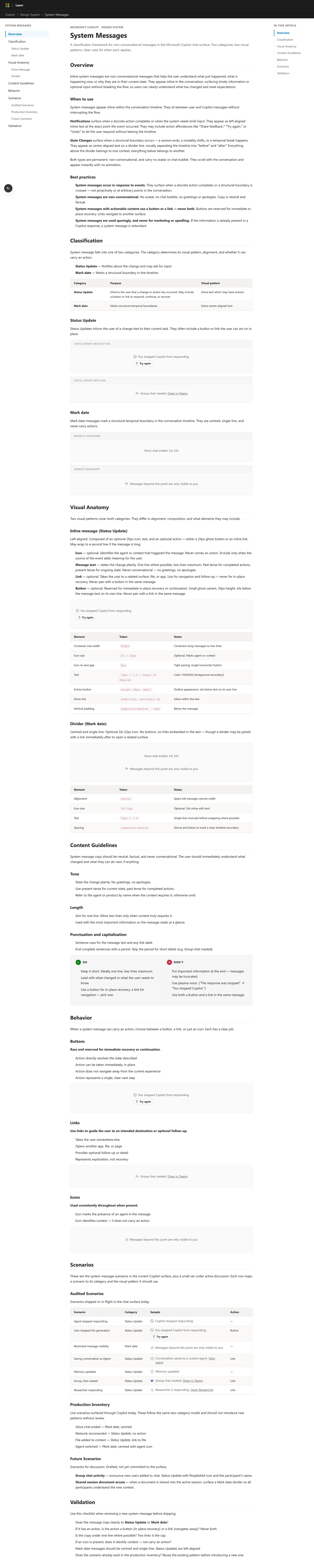
System Messages
A field guide to chat notices: when to show them, how they behave, and when the interface can say enough on its own.
- When
- Feb 2026
- AI tools
- Claude Code
- Status
- Working
- Type
- Web app
Starting point
As a chat product grows, confirmations, session boundaries, access notices, and errors can start to look alike. That makes it harder to tell who is speaking and whether a notice changes how to read the conversation.
Deciding what belongs in the conversation
A completed action, an ended session, or a change in who can see a conversation can all affect how someone reads a chat. These notices come from the system, so their wording and placement need to distinguish them from the user and assistant.
I grouped the notices into four categories, then added a decision tree to help decide whether a system message belongs in the conversation at all. Assistant responses, service errors, and ordinary interface changes need their own treatment.
The result is a one-page field guide covering message parts, placement, persistence, timing, interaction, and writing. It gives the categories concrete rules and examples, including reasons to leave a notice out.
In the current build
- Four categories cover action acknowledgements, session lifecycle markers, context boundaries, and conversation-wide access notices.
- A decision tree separates system messages from assistant responses, application errors, and UI state changes.
- Each category explains its parts, placement, persistence, timing, interaction, and writing rules.
- A sidebar, table of contents, and examples support a single-page reading path.
Known limits
- The site is a reference guide, with no authoring workflow or component playground.
- The public examples omit internal product scenarios, policy, and visual tokens.
- The categories need testing against more scenarios to find ambiguous or overlapping cases.
- There is no search, contribution workflow, version history, or automated documentation testing.
What it does
- Browse four categories of system messages
- Use a decision tree to distinguish system notices, assistant responses, application errors, and UI state
- Navigate the one-page guide through a sidebar and table of contents
- Read guidance on message parts, wording, placement, persistence, timing, and interaction
- Compare the roles of chat messages, message bars, and UI state changes
What I learned
Writing the decision tree made me pay more attention to when a message adds nothing. If the interface already makes a state change clear, repeating it in the conversation can get in the way.
Screenshots
 Home · Desktop
 Home · Mobile
05 / 06 · Agent behaviour and authoring · Prototype
Agent Canvas
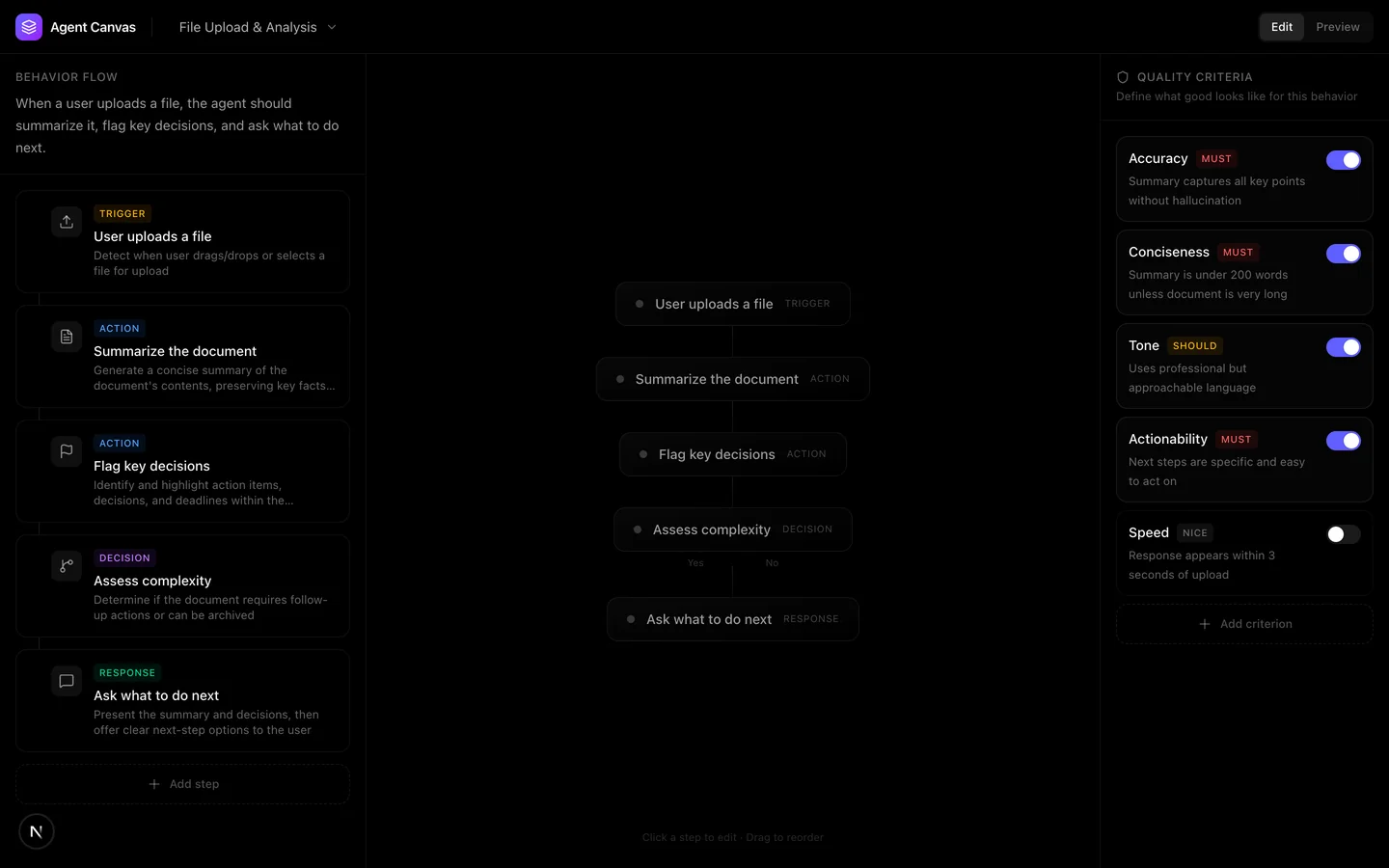
A canvas prototype for discussing an agent's steps, instructions, and quality criteria alongside a simulated conversation.
- When
- Feb 2026
- AI tools
- Claude Code
- Status
- Prototype
- Type
- Web app
npm install && npm run dev
Starting point
An agent's behaviour can be scattered across prompts, configuration, and orchestration code. I wanted to make the product decisions visible enough for a designer, PM, and engineer to discuss together.
Put the decisions behind each turn on a canvas
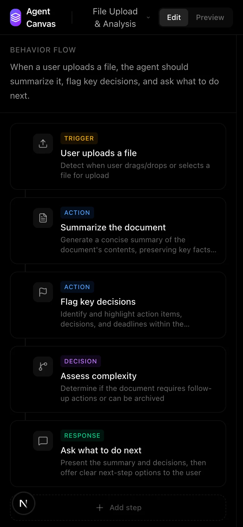
I could draw a user flow, write a prompt, or mock up a conversation, but I wanted to see the decisions behind each turn in one place. I built a node-based canvas with familiar editing conventions and an inspector for each step.
Selecting a trigger, action, decision, or response reveals its instruction, output, and quality criteria. A separate preview replays a short simulated conversation while highlighting the active message and node.
I built enough interaction to explore how a team might discuss agent behaviour. Several controls are still unfinished, edits disappear on refresh, and the preview doesn't respond to canvas changes. Those limits matter: the current build demonstrates an authoring idea, not a working agent.
In the current build
- Three sample scenarios show onboarding, file analysis, and error recovery as connected five-step flows.
- The canvas distinguishes triggers, actions, decisions, and responses.
- Quality criteria sit beside each step with must, should, and nice-to-have weights.
- Preview mode replays a simulated conversation and highlights the active canvas node.
Known limits
- Preview replays one hard-coded scenario; it does not generate a conversation from the edited flow.
- Edits live in component state and disappear when the page refreshes.
- Dragging, adding steps, and some toolbar controls are visible but do not work yet.
- There is no agent backend, persistence, automated test suite, or deployment.
What it does
- Switch between the flow editor and conversation preview
- Browse three sample agent scenarios
- Inspect trigger, action, decision, and response steps
- Edit step instructions and toggle weighted quality criteria
- Replay a simulated conversation with active-step highlighting
- Pan and zoom around the canvas
What I learned
The next useful step is to make Preview read the edited flow. Until that connection works, I can use the canvas and conversation to discuss an idea, but I cannot test whether an edit changes the behaviour.
Screenshots
 Home · Desktop
 Home · Mobile
03 / 06 · Agent output comparison · Prototype
Behavior Diff
A word-by-word comparison of responses after one prompt, constraint, or input change, using authored examples.
- When
- Feb 2026
- AI tools
- Claude Code
- Status
- Prototype
- Type
- Web app
npm install && npm run dev
Starting point
A small edit to a prompt, policy, or context can produce a much larger change in a response. Reading two full outputs side by side makes it easy to miss where the wording changed.
Show the changed words and the change behind them
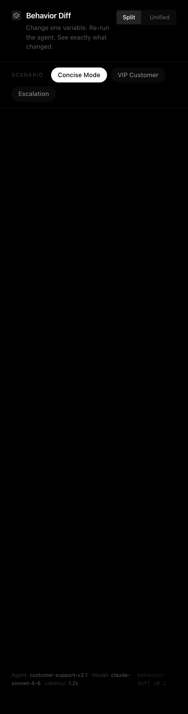
I wanted to make changes in agent responses easier to inspect. A code-style diff seemed useful: show the wording added, removed, or left unchanged, then let the reader decide what those differences mean.
I built three controlled examples. One changes the response requirements, one adds a VIP constraint, and one changes the incoming customer message. A custom word-level diff powers both split and unified views, so switching views keeps the comparison consistent.
The examples are authored and the rerun is simulated. That let me work through the comparison interface before connecting a model. I haven't yet tested how well these views handle responses that vary from run to run.
In the current build
- Three authored scenarios each change one thing: response requirements, a VIP constraint, or the customer's message.
- A custom longest-common-subsequence engine identifies word-level additions, removals, and unchanged text.
- Split and unified views use the same diff result, with aligned lines and empty rows to keep the comparison readable.
- The interface shows change counts, the exact setup change, and a simulated rerun state.
Known limits
- The responses are authored examples. Rerun does not call a live model.
- All three scenarios concern customer support; other domains have not been tried.
- The configuration is visible but cannot be edited in the interface, so new experiments require code changes.
- There is no backend, persistence, automated test suite, or committed deployment.
What it does
- Switch between three scenarios, each with one changed variable
- Compare responses in split or unified views
- Inspect word-level additions, removals, and unchanged text
- See counts of added, removed, and unchanged words
- Read the exact configuration, constraint, or input change
- Replay a simulated before-and-after run
What I learned
Naming the changed variable gives the diff context. With several edits at once, I couldn't tell which one explained a difference in the response, so I kept each example to one change.
Screenshots
 Home · Desktop
 Home · Mobile
06 / 06 · Conversation design patterns · Working
Conversation Pattern Library
Six searchable conversation patterns, with guidance on when to use them and examples you can replay turn by turn.
- When
- Feb 2026
- AI tools
- Claude Code
- Status
- Working
- Type
- Web app
npm install && npm run dev
Starting point
Clarifying a request, recovering lost context, or confirming a risky action often gets solved inside an individual mockup. The reasons for those choices are harder to carry into the next conversation design.
Find a pattern for the conversation at hand
I started with the task of finding a pattern for a particular conversation problem. The library needed to explain when a pattern applies, where it stops, and how it works over several turns.
I authored six patterns: Clarification Loop, Progressive Disclosure, Graceful Fallback, Escalation to Human, Destructive Action Confirmation, and Context Recovery. A shared data schema feeds search, category filters, anatomy diagrams, guidelines, and replayable examples.
The current build makes that starting set browsable. It still needs a contribution workflow and links between related patterns, since a single conversation may need several of them.
In the current build
- Six authored patterns cover clarification, disclosure, error handling, handoff, and confirmation.
- Each pattern includes when-to-use guidance, principles, four anatomy steps, a conversation example, and tags.
- Search matches names, descriptions, and tags; category filters update the visible count.
- Live Preview, Anatomy, and Guidelines show the example, structure, and advice for the selected pattern.
Known limits
- Six patterns provide a starting set, with many conversation situations still uncovered.
- Patterns are static TypeScript data; there is no authoring, review, or contribution workflow.
- A selected pattern has no deep link, and browser history does not record the browsing path.
- Related patterns are mentioned but are not connected by links or relationships in the data.
What it does
- Search by pattern name, description, or tags
- Filter across five conversation-design categories
- Browse a compact, collapsible pattern index
- Switch between Live Preview, Anatomy, and Guidelines
- Replay multi-turn examples with agent, user, and system roles
- Read principles, tags, and guidance on when to use each pattern
What I learned
A useful pattern needs to explain where it stops. Documenting those limits also exposed a missing part of this library: links between patterns that often appear in the same conversation.
Screenshots
 Home · Desktop
 Home · Mobile
02 / 06 · Figma tooling and automation · Prototype
Figma Redline Bridge
A local bridge for drawing spacing measurements and specifications in Figma from an AI tool or script.
- When
- Feb 2026
- AI tools
- Claude Opus 4.5
- Status
- Prototype
- Type
- Figma plugin
Starting point
I wanted to stop drawing the same spacing arrows by hand. An external script can't draw directly into an open Figma file, because the Plugin API runs inside Figma's sandbox. I needed a local command route I could inspect and debug.
Getting a command into the open Figma file
The first test was small: send a command from outside Figma and draw a spacing measurement in the open file. Getting it there required several steps.
The local relay turns an HTTP request into a WebSocket message, sends it through the plugin iframe with postMessage, and calls the Figma API. Replies return along the same route. Once that worked, I added dimensions, colour swatches, typography specifications, page creation, and ordered batches.
The project grew into documentation experiments, but I kept the annotation work under human control. A person chooses what needs explaining; the bridge handles the repeated drawing commands.
In the current build
- Commands travel from an HTTP client through a Node relay, WebSocket, and plugin iframe into the Figma sandbox.
- Commands cover spacing, dimensions, colour, typography, page creation, and ordered batches.
- The server queues individual commands while Figma is disconnected and reports connection state through a health endpoint.
- The plugin rescales cloned frames to preserve auto-layout instead of changing their dimensions directly.
Known limits
- The localhost command endpoint has no authentication and is intended for a trusted local machine.
- Only one Figma client can connect at a time; a new connection replaces the previous one.
- Batch commands fail while Figma is disconnected, rather than joining the individual-command queue.
- Setup requires a server process, a plugin build, and a manually loaded Figma development manifest.
- The message route across runtimes has no automated test suite.
What it does
- Send structured commands from an AI tool, CLI, or local script into Figma
- Draw spacing measurements and dimension labels
- Generate colour swatches and typography specification boxes
- Create pages and execute ordered command batches
- Queue individual commands until the plugin connects
- Check server and Figma connection state through a health endpoint
What I learned
Most of the work was getting a command through the runtimes and Figma's sandbox without breaking auto-layout. Keeping the protocol plain made it easier to follow a failed command back to the step that lost it.
Owly · Working
Early Owly marketing page
An early direction for the Owly homepage, with a video carousel, motion, and a before-and-after comparison.
- When
- 2026
- AI tools
- Claude Code
- Status
- Working
- Type
- Web app
npm install && npm run dev
A marketing page from an unexpected detour
I opened this folder to try connecting Figma to an MCP server, then ended up building an Owly marketing page in it. The folder name records the detour.
The Next.js page brings together a hero, scroll highlights, a tabbed video carousel, feature sections, and a before-and-after comparison. Its art direction is different from the Owly site we later shipped, so it remains a record of an earlier direction.
What it does
- Animated homepage with navigation and a hero
- Scroll-highlight section
- Video demo section
- Tabbed video carousel
- Feature and workflow sections
- Before-and-after comparison
- Reusable button and logo components
Screenshots
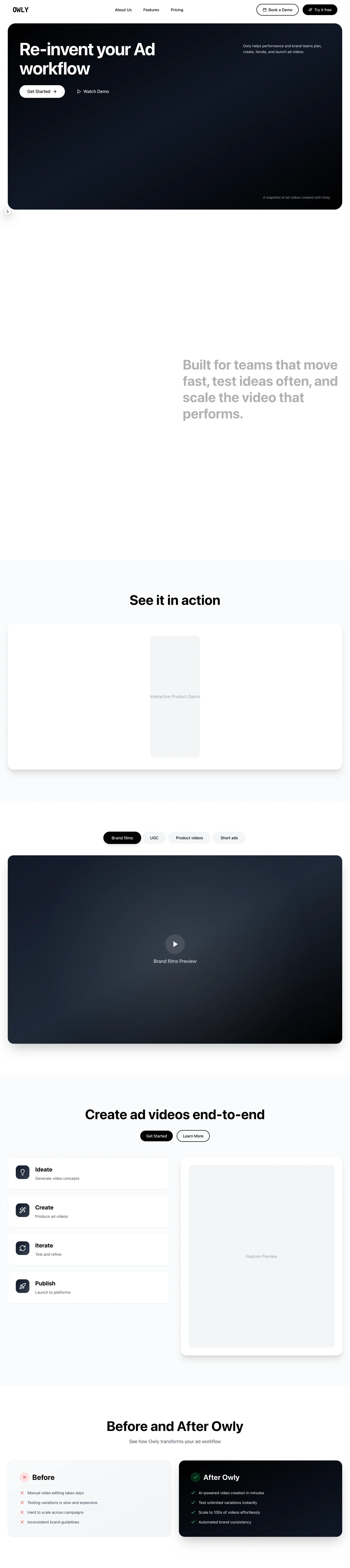 Home · Desktop
 Home · Mobile
01 / 06 · Screen recordings and AI review · Working
FlowSense
Reviews screen recordings against a UX rubric and links each finding to the frames a designer can check.
- When
- Feb 2026
- AI tools
- Claude Opus 4.6 / 4.5
- Status
- Working
- Type
- Full-stack
Starting point
A screenshot can miss delayed feedback, backtracking, or an error that stops a flow. A recording shows those moments, but reviewing it takes time and different reviewers may notice different things.
Separate the observation from the score
I wanted a repeatable first pass through a recorded user flow, with enough evidence for a designer to question the result. A score alone wouldn't help me understand what the review had seen or missed.
The experiment grew into an upload interface, video processor, shared schemas, storage, frame analysis, and reports. My key decision was to split the model work into two passes. The first describes visible interaction events; the second scores those observations against the rubric.
I also made the limits part of the report. Findings link to frames, repeat runs show differences, and an analysis cut short by the budget can warn but cannot pass. The build supports review, but its scores still need validation against a human-labelled set.
In the current build
- A weighted, seven-category rubric produces a score from 0 to 100 and a pass, warn, or block result.
- The processor extracts frames, selects visible interaction changes, and separates fact extraction from rubric scoring.
- Reports link findings and recommendations to source frames and compare repeat runs for possible regressions.
- The processing path includes signed webhooks, nonce replay checks, managed identity, and atomic SQL claims.
- The monorepo includes focused tests, CI checks, shared schemas, and a harness for agreement and release metrics.
Known limits
- The tool needs configured Azure services and credentials, so there is no one-click public demo.
- Local development bypasses authentication; a deployment needs to re-enable it.
- Benchmark code exists, but there is no populated, human-labelled holdout set to validate it against.
- If a recording exceeds the analysis budget, the result can warn but cannot pass.
- A designer needs to decide whether the rubric fits the product and whether the cited frames support each finding.
What it does
- Upload and process UX screen recordings
- Extract frames and select visible interaction changes
- Use one vision pass to describe interaction facts and a second to apply the seven-category rubric
- Report pass, warn, or block with findings, recommendations, source frames, and differences from a previous run
- Open the source frame behind a finding
- Store runs and media in Azure SQL and Blob Storage
- Protect processor calls with signed webhooks and replay checks
- Export review reports as PDF
What I learned
Separating 'What happened?' from 'How does it score?' made the model's findings easier for me to trace. I can check the observed interaction first, then question how the rubric scored it.
Owly · Working
Owly Studio
The Owly product workspace, from onboarding and brand inputs to media libraries and timeline editing.
- When
- Nov 2025 - Mar 2026
- AI tools
- Claude + Cursor
- Status
- Working
- Type
- Web app
Following the product idea into everyday use
Working on Owly Studio means following the product idea through the screens people actually use. I've worked across onboarding, the creator dashboard, media libraries, creation forms, and the timeline editor, including the loading states and authentication around them.
The product uses Supabase, FastAPI, and Remotion. As we add capability, I keep returning to how someone finds the next step without needing to know our internal terms. The interface is still changing as that work continues.
What it does
- Email and Google sign-in through Supabase
- Onboarding flow
- Chat-style AI creator dashboard
- Libraries for videos, storyboards, and static ads
- Timeline editor with a Remotion player
- Static ad creation and editing
- UGC and CGI video forms
- Brand DNA and product catalogue tools
- Explore page with featured videos
- Admin and profile pages
Screenshots
 Login · Desktop
 Login · Mobile
Owly · Working
Owly marketing site
A video-led introduction to Owly, with product features, pricing, tools, and articles to explore.
- When
- Feb 2026 - Mar 2026
- AI tools
- Claude + Cursor
- Status
- Working
- Type
- Web app
A misplaced link
Let's get you back to the work.
That project or note isn't here. Open the computer to explore projects and case studies.
Open my computer